
The purpose of the Key Performance Indicators (KPI) graph is to show you immediate feedback on your most important KPIs when you view the Search Report. You can display up to four KPIs at one time.

To change the settings for the key performance indicator (KPI)
1. Click the View segments dropdown list.

The KPI dialog appears
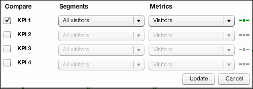
You can do either or both of the following:
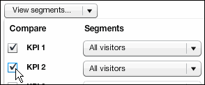
The following steps for choosing KPI options apply in both cases.
2. In the Segments column, click the drop-down list that displays All visitors, and then choose the segment you want.
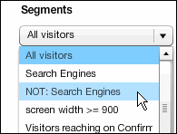
3. In the Metric column, click the drop-down list that displays Visitors, and then select the metric you want.
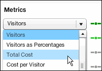
NOTE The short line that appears in color to the right of the list indicates the specific segment you choose. The line on the graph that represents the segment is the same color.
4. When you are finished, click Update.
To choose a general timeframe for the graph
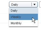
Click the drop-down list that displays Daily, and then select the timeframe you want.
To view the data for a specific point in time
Move the pointer over the line in the graph. Here is a graph set to "Daily:"
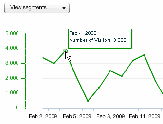
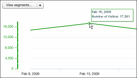
The data point usually occurs where there is a bend in the line. Here's the readout for a graph set to "Weekly":
To show or hide the KPI Graph
Click the Show/Hide button in the upper right corner of the page.

When the left side of the button is selected, the graph is displayed. When the right side is selected, the graph is hidden.